Ever wondered when you walk into a hotel room about the furniture and furnishings? This area is covered by much more legislation than the domestic market. For instance, the furniture needs to be of contract quality, normal domestic furniture would not take the wear and tear. Also, all the fabrics and carpets needs to be fire resistant and contract standard. This is why any soft furnishings tend to be of a heavier quality than you would have at home.
This is the view from one of the rooms of the balcony on the 18th floor. It was very private as the slats on the right hand side were angled so very cleverly that we were not aware of a balcony next to us. This hotel was owned by a French chain and only 2 years old in Nha Trang central Vietnam.
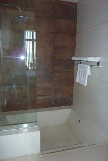
Same hotel room but with two views of a composite marble sunken bath/shower. Luckily the shower head was a hopper style therefore the towels at the end of the bath did not get wet. This was not the case in some of the hotel bathrooms. In at least 3 other hotels the towels were damp from the shower before use because the shower head was angled towards the towel rail at the end of the bath.
The most common design fault especially in bathrooms in Asia is the highly polished marble/granite flooring. Although it can look wonderful especially with down-lights reflected, when wet this type of flooring can be it can be very slippery and dangerous. It would be much better to install a non-slip flooring.
Another hotel room in Dalat in the Highlands. This hotel had been newly renovated and had a cool lilac and neutral colour scheme. The seating was upholstered in a faux suede and the flooring was wood.
The lighting was also very clever with up-lighting behind the false wall which combined with the nice colours made it a lovely room to stay in. The screen between the seating and sleeping area was lit from below the etched glass, giving the illusion of two separate areas.
This idea could be used at home to provide screening in a large room. Self-adhesive rolls of faux etching can be bought and cut to any design; this can then be stuck on to safety glass.
Last but not least is my favourite airport of all time – Kuala Lumpur or KLIA as it is locally known. This is were we get polished marble with reflected downlights overload! This airport also has an enclosed jungle area in the centre, which has grown considerably from when I was there 10 years ago and it even has a waterfall now.
Now, why can’t they design airports here like this as opposed to the glorified hanger called T5 Heathrow?
Anne Stuart


No comments:
Post a Comment