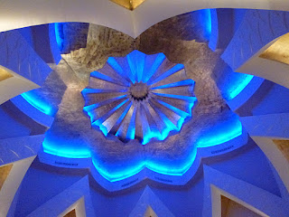
Just returned from holidaying in Muscat, Oman and I thought I would share with you the stunning lighting design in the hotel where we stayed. Getting the lighting right in a design is always a problem, get it wrong and it looks awful, get it right and it is magical. Apparently it took the lighting designers weeks just to plan these public areas.
Above is a photo of a restaurant. Notice the LED’s in the ceiling reflecting in the highly polished stone floor. This restaurant had a Moroccan theme.
The lights above are massive.To give an idea of size, there are doors to the outside at the bottom of the picture.
Above are photos of part of the public areas by day and night. All the lighting was recessed or up lit.
This is the front drop-off point by the reception by day and night. The lighting takes advantage of the architecture, giving a wonderful ambience.
Taken from the reception at night looking towards the drop-off point.
This is a photo of the ceiling in the reception, lit by day and then by night.
Hope these examples give you an idea of how to light areas both inside and out whilst taking advantage of any architectural features.
Anne Stuart


Hello I like the picture of the arches in the day the light seems to provode a natural lit path the trees. Lots of great lighting tip thank you for an interesting blog
ReplyDelete